Here are the spared links on youtubes of my videos.
If you are using Apple product, you may find that you can't watch the e blogger video.
please click the following links instead.
Thank you.
Animation 1
http://www.youtube.com/watch?v=39eEBiQtzqc
Animation 2
http://www.youtube.com/watch?v=6pya5O1iC9w
Animation 3
http://www.youtube.com/watch?v=7UbcpNlE1C0
Sunday, March 27, 2011
Chosen textures for the model
I have chosen textures which could communicate the contents and features of the two different parts in my model
Upper part- Rhythm
Upper part- Rhythm
The compressed and dense textiles would suggests the rectangular geometry of the rhythm part, also they matches the heavy and solid characteristics of the part.
Lower part- Organic
The ductile and soft textures matches the curvy light design of the organic part. It suggests the delicate design and contrasts with the above part.
Stairs
initial sketches
Stairs A
-plan, sections, perspective
Stairs B
-plan, sections, perspective
Stairs C
plan, sections
Stair D
plan, sections
Stairs E
perspective
Stairs F
perspective
Developed Model
I have decide to choose the "Rhythm and organic" concept, because the differences among the two spaces are more obvious and I would make bigger contradictions among the two spaces.
Meanwhile, as for learning processes, having curvy and straight elements in my assignment would practice my skills of architectural programming. And having two contrast parts in my model, I would be able to generate two different feelings of the two spaces. I would be able to make use of two sets of materiality for the spaces. The building would be much more inspiring and stunning.
Talking back to the design approach, having clear identification of the upper and lower spaces would define the functions of the spaces better and clarifies the gallery space and studio space clearly. Moreover, two contrasting approaches would be more playful and fun to stay in, giving more inspirations to both artists and visitors.
First attempt of developed model
For the upper part, l I start making inspiring spaces with different scale of trangles and different sizes of rectangles as different stairs.
However, the geometry is not that matching in overall and interiors is not talking in the same language with the exteriors.
The stairs is having similar geometry with the overall shapes, however, because of different orientation (vertical and horizontal), the building seems to have different components but not as a whole.
For the below part, everything seems working well by defining interior subspaces in leave motifs and having the exterior affect the interiors.
AND THE FAILURE AND DISADVANTAGES OF THIS MODEL HAS LEADED TO THE SECOND ATTEMPT OF DEVELOPED MODEL.
After changing the interiors following the exterior geometry and having horizontal elements all along the above part while curvy and floral division elements in the below one; the model is able to communicate the concept rhythm and organic sharply.
The Second Chosen Sketch section -sharp and point
The Second Chosen Sketch section
-Sharp and point
Although this sketch has similar contrasting feature among upper and lower spaces like the first chosen sketch does, It contrasts with the volumes of the spaces but not the geometries of the spaces.
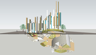
This idea could be attractive with future/cyber feeling, making in giant scale and stand on land. It is outstanding and could be chosen for landmark. The above part has different sharp angles popping out from the form, giving strong ideas of sharpness and heaviness. On the contrary, the below part has tiny room pointing out one sharp angle, which communicating the idea of point.
The advantage of this sketch is the above and below part contrasts by volumes but yet would consider as a whole because of similar geometries.
Pictures of sketch model of the idea
The First Chosen Sketch section -Rhythm and organic
The First Chosen Sketch section
-Rhythm and organic
This sketch gives a very strong contrast among the upper and lower places.
The rectangular geometry of the upper part suggests me the heaviness and solid form, while the curvy organic shape of the lower parts interprets something light and delicate.
To interpret rhythm, a repetition of forms with vary elements (size, orientation, direction, scale),
would be very playful and give a strong sense of the idea.
To interpret organic, waves, curves and forms and patterns of plants would communicate.
Adding interesting sharp translucent colors to the form would suggest a greater intensity of delightful architecture, while at the same time represent the lightness of the form.
Pictures of sketch models of the idea
18 Sketch sections
Here are 18 of different architectural sketch sections I drawn based on the nine words inspired by the three artists.
The 18th original concept sketch sections
Subscribe to:
Comments (Atom)


